I can hear myself echoing in my own head, constantly reminding my students to keep it simple. Here’s a few ways they can actually do that.
We’ve got almost 17 million colors to use, millions of typefaces (fonts), and thousands of tools online and in the Adobe software. You don’t need to use all of them in one project, but the use of restraint comes with time and confidence. You’ll look back at a project you did a year ago, two years ago, etc., and you’ll think to yourself, “Man, I could have got rid of this, and this, and this. I could’ve done so much more with so much less.”
There’s a certain level of restraint and refinement that comes with each new project you complete, but you just have to know when to be done. “A designer knows he has achieved perfection not when there is nothing left to add, but when there is nothing left to take away.” – Antoine de Saint-Exupery. Of all the designer quotes I’ve ever seen, I love this one. Less isn’t more just for the sake of it, but less is more for the sake of eliminating the unnecessary. It’s also helpful to have a pair of fresh eyes around to critique you, so they can shoulder surf and say STOP every now and again.
This might be an extreme example, but often time design is more about taking things off the page than it is adding them. Again, this comes with time.
Also, don’t forget about that handy old #2 pencil. If you’re not sketching out ideas before you’re jumping on the computer, you’re wasting a ton of time. There’s no way on earth you can work faster on a computer than you can with that pencil. Keep a journal and a pencil with you everywhere you go. I’ve began doing that in the last few years, and it’s helped me immensely.
Yeah, you’ve probably got a Macbook Pro in your backpack, a smart phone in your pocket, and an iPad laying around somewhere near the couch, but nothing replaces that pencil and pad – remember, simple.
You’ll look back at a project you did a year ago, two years ago, etc., and you’ll think to yourself, ‘Man, I could have got rid of this, and this, and this. I could’ve done so much more with so much less.’

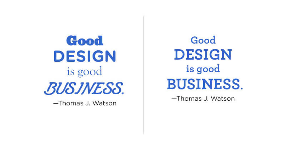
Moving along to more technical stuff like the 16 million colors. Make sure you’re learning about color theory and color psychology as it relates to marketing. This will help give you a concrete reason to avoid using a full rainbow of a color palette. Usually 2-3 colors is enough, maybe 5-6 using various tones, values, tints, shades, etc. of each color.

The same goes for fonts. Please chill with the two dozen fonts from DaFont. This is something I find myself stressing to my students, but it doesn’t always sink in.
That kind of stuff has its place every now and again, but honestly you’ll rarely ever need more than 2, 3 max, fonts for any single project. A good idea is to look up the work of a successful designer you admire, and make note of the way they use type. You’ll have a light bulb moment 5 minutes into your Google search.
Sometimes it’s not about fonts and colors. Sometimes, keep it simple stupid can be simply (see what I did there?) not trying to solve every problem with a single project. That ends up getting cluttered, fast. If you’re asking the right questions, you’ll know what problems are biggest, and you can design to address those, eliminating the fluff. Keep it simple stupid is one of those things I could go on and on about, but maybe I’ll turn this one into a series of blogs one day to elaborate more.
I can remember being back at LSCCF getting my associates. I’d walk into class on presentation day and see everyone else’s projects, and I’d get a smug little comfort after seeing my competition. Don’t get me wrong, there were plenty of talented students with me, and I don’t think I was the best one. However, since we were all new, we hadn’t really learned restraint yet. Being a minimal dude by nature helped me figure that part out quickly, almost naturally. So my projects quickly began looking more like pro-work than college projects, and my peers, teachers, etc. recognized it. Thank God!
I talk about this extensively in my book Why Didn’t They Teach Us This in School? Creative Career Life Lessons from a Stumbling Success. Buy it today on Amazon if you want a tried and true blueprint for scaling yourself, learning from my mistakes, and learning super easy ways to grow faster in your creative career.
Keeping it simple has lots of merit in the technical aspects of your projects, but it goes on and on. Your backpack when you’re on the road, what you’re wearing, your work space and how you save your files, etc. Keeping it simple could be related to purchasing gear or tools too. In the next blog, I’ll share about copying. Like, completely ripping off other people’s work. Shamelessly. I swear.
Ohh, P.S. Keep it simple stupid is an acronym you might hear of one day: K.I.S.S.